Web Design
Case Study
kingspan
Kingspan are in international business specilaising in insulation panels, flooring, steel applications, hot water cylinders, containers and much more.
CMS
Kentico
URL

DESIGN PROCESS
Being an international global brand, Kingspan’s new website had many stakeholders who all wanted their division represented. With over 20 areas of specialism and variations of those means Kingspan has hundreds of products to display on its website but at the same time gives the site a modern clean, simplified look.
1. Time Management
Using Asana with its Gantt chart option, this was shared with the wider team and stakeholders to show timelines clearly and when information was needed. This helps manage the expectations of the stakeholders.
2. Research
Customers were asked for their feedback on what they would like to see on a new site to help them. This was done via Survey Monkey. From this, mock-up pages were made to gain further feedback. I also needed to ensure the many products were easy to find.
3. User Testing
Mock-up pages we shown to customers and key stakeholders for feedback. A/B testing landling pages also created that included user guides and downloads in different areas of the pages to gauge user interation.
4. Team Management
Managing a small team that was spread throughout Europe and also an external web-development company for specific Microsoft Dynamics integration presented its own challenges but also language challenges.
OUTCOME
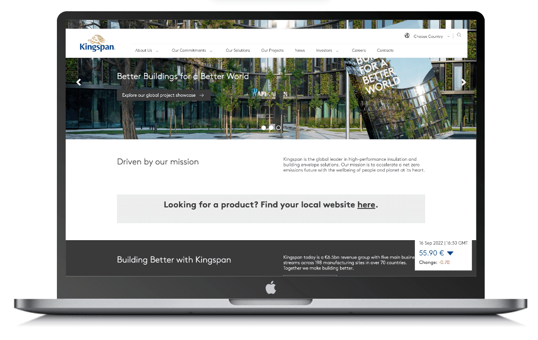
In the final design, I decided on a full-lenth hero image with a prominent search bar. The user can see two sub-menus. The most obvious one is the horizontal one listing their products, then appltions and then services. It take the user on a logical journey ie what the products are, their application.
I put a smaller search bar as a lot of users were used to using and seeing a search function there.
Then the burger menu at the end of this row. The menu and the burger menu is a flyout menu with the burger menu offering the three main services plus some additional options such as a contact page.
This leaves the areas above the fold as a nice clean looking website. The aim is not to overwhelm the user with too much information.
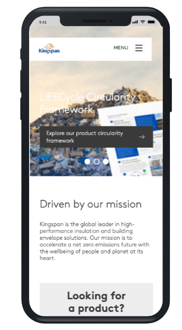
The mobile version, as seen to the left, forgoes the three options and just has the burger menu so as not to clutter the smaller screen.
OLD SITE DESIGN
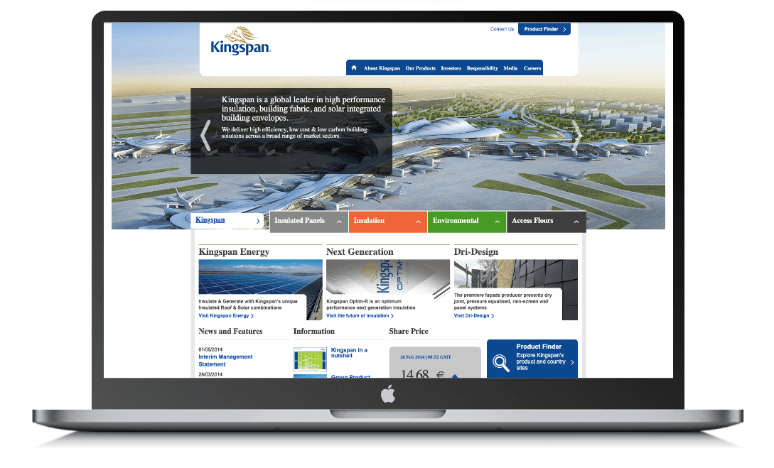
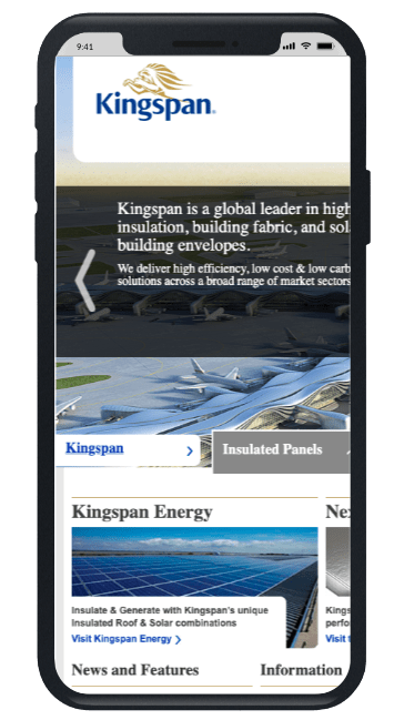
As a comparison, the old site built using Magento 1 is quite cluttered and not particularly mobile friendly.
In terms of design the user interface was cluttered and as was the menu system.
Let’s Start Something new
Say Hello!
Excepteur sint occaecat cupidatat non proident, sunt in culpa qui officia deserunt mollit laborum. Sed ut perspiciatis unde omnis.